Problem
TCC had a logo and a colour palette. Nothing else. In advertising that means every campaign starts from zero: a new key visual, made by a different designer, with no memory of the one before. The brand was on air constantly and recognisable in none of it.


Constraint
It had to be simple enough to survive other people. The system would be executed by designers I would never meet, on deadlines I wouldn't control. Anything that needed explaining would be dropped on the first Friday.
5×5 grid · 2×2 module
Opacity 0.15 / 0.30 / 0.55 / 0.75 — hard edges, no blur, no gradient.




Decisions
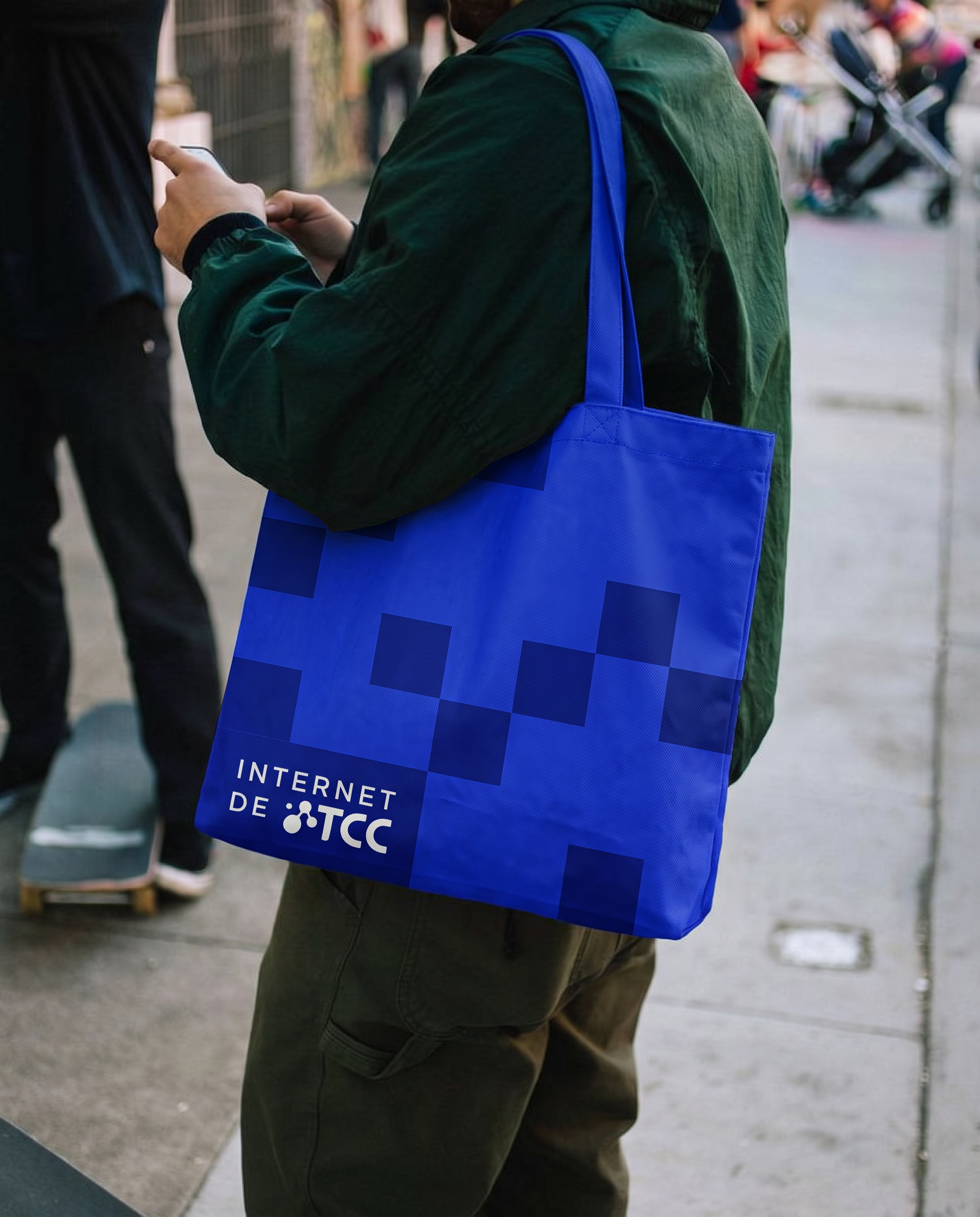
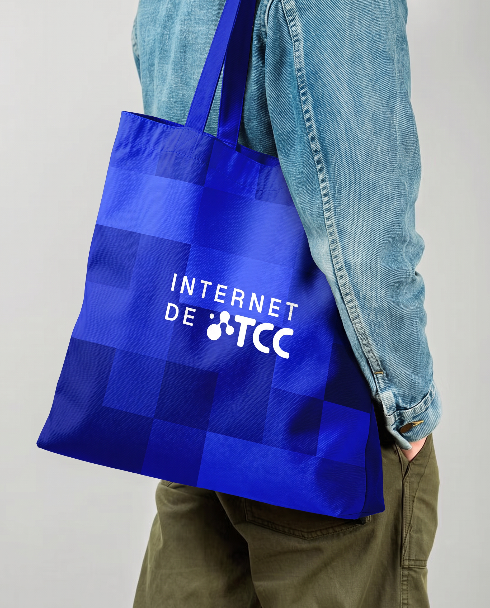
I took the device from the logo. The isotype is built from nodes, so I turned that into a modular grid of translucent squares. Nobody has to memorise the system — it's already in the mark.
I wrote rules instead of layouts. The squares can't cover more than 30% of the image, can't sit over faces, can't hide information, and always run in one direction. That leaves the composition open and the identity closed.
I let the temperature move. The same grid holds a warm photographic register and a flat high-contrast one. What repeats is the device, not the mood.
What I learned
The value wasn't in deciding how TCC looks — it was in leaving room for it to change tone without stopping being itself. Next time I'd spend longer on the rules for what not to do; those are the ones people actually read.
Next case
03Mosca × Pérez Scremini